This year, the big data market has grown by almost 20%. By 2020 there will be about 40 trillion gigabytes (40 sextillion bytes) of data. Right now, internet users generate about 2.5 quintillion bytes of data each day, just on the internet (a quintillion is 1 followed by 18 zeros!). Let’s visualise that a little for you, if you took 2.5 quintillion pennies, one for each byte of data, and laid them out flat, they would cover the Earth – five times over.
It is safe to say that data is everywhere. We are constantly creating, downloading and trading it. It is more valuable than oil, but unlike oil, there is an infinite supply and it can be used over and over, analysed and reanalysed to provide new insights, perspectives and value.
Although we are getting better at making data useful and usable, still only a small percentage is properly tagged, analysed and understood. This means only a small percentage is living up to its potential value. We have already seen how data can be used for bad, through misleading articles or even meddling in politics.
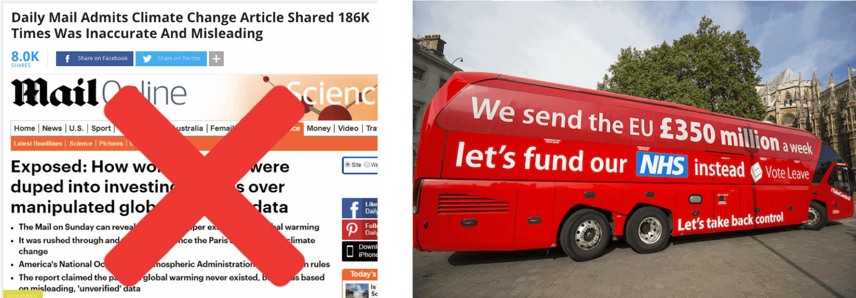
But when data is good, it is really good. So, it makes sense that we should strive to analyse and present it in the most effective, honest and hopefully beautiful way possible. No one is doing that better than data visualisers and data journalists.
A few weeks ago, I attended Encode’s inaugural conference…
It was called Encode: Data Journeys in Design, Journalism and Education. Short answer? It was epic. The most enlightening learning from the two days is the myriad of different ways and breadth of sectors in which data visualisation is, can and could be used for good, across the world; from healthcare to art and music.
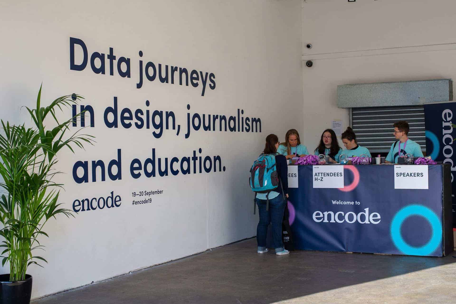
So, to give you just a peek at what data can really do, I wanted to share some examples that stuck with me. Just a couple of ways that data can be used for good, to make a difference in our lives.
Data visualisation in medicine and healthcare
There is a lot of data in medicine; such as the vital signs monitors measuring heart rate and blood pressure. But they were created by practitioners, not data visualisers and have remained relatively unchanged for years.
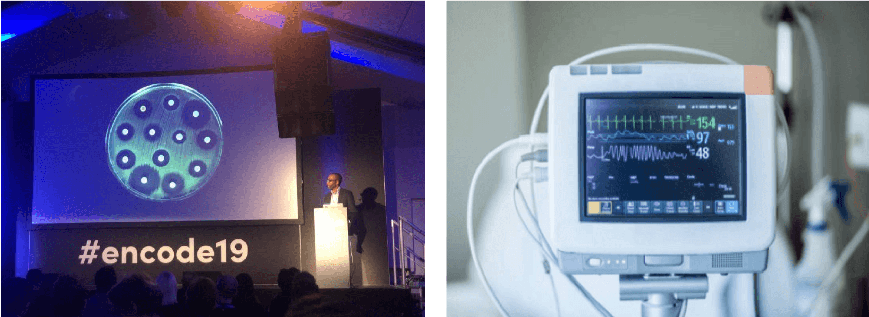
Though not ineffective in fulfilling their basic job of displaying vital signs, this is just one example of where there is much more opportunity for added value, where data is not reaching its full potential. If that data was recorded, the integration of robotics, big data analysis and visualisation could create real-time insights, trends and health status outputs before a doctor even steps in the room. Potentially reducing the burden on health services.
If this data was recorded, analysed and visualised properly, it could also be used to aid conversations with patients. Visual data is processed 6000x more rapidly that text and far more effective, a picture is worth (six) thousand words. You can talk to someone as much as you like about percentage increases in health risk or prevalence of disease, but for some people, numbers mean very little. But when visualised or contextualised, even in terms of the patient’s own data and life, it can help change behaviour.
Digital twins
For years, the use of digital twins has been used in fields such as space exploration. Space shuttles are for all intents and purposes, priceless. So, running tests or practice launches with the actual equipment is, understandably, not feasible. Enter digital twins. Having an accurate digital replica of a space shuttle allows NASA, for example, to run simulated launches and tests and fail, without damaging any actual assets. Ultimately increasing safety and reliability to a level that would be unimaginable without the use of this technology. This is also true of the shipping industry. The use of digital twins is becoming more and more integral, improving safety, performance and efficiency.
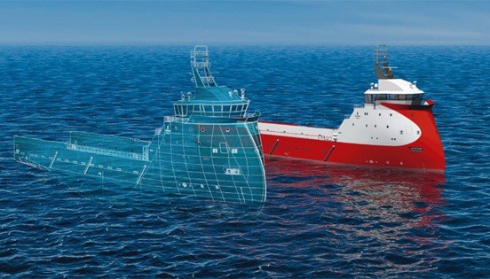
But it is the other potential applications of digital twins that are most game changing. Computers can understand data in its raw format. As the flawed beings we are, humans need more meaningful representations of data to understand what the heck is going on. We do not decide anything in a vacuum. We are emotional, irrational and bias by nature and this affects how we make decisions.
Recent trials have seen digital replicas of entire cities created that have implications on everything from crowd control to government policy decisions and the environment. There are even examples of this in the UK. Forgetting for a moment the obvious data protection issues, creating full digital replicas of real cities and their inhabitants that run autonomously, operating purely off the data, could offer insights and make decisions without the irrationality and bias of humans.
It could test the efficacy of policy changes targeting the protection of the environment or crowd control measures. It could help predict disasters before they happen and maybe even prevent them. It could also suggest solutions we perhaps did not consider. It could use all the available information and make decisions at a higher level of logic, not possible for humans.
We live in a data-driven, machine-intermediated world…
It is unavoidable. Data is everywhere. But how we use and present this data will determine its value. We could use it for the betterment of society. To learn about our world, test our ideas and make better decisions. We could be heroes. Or we can be villains. We could use it to manipulate and mislead. The decision is ours to make, we just have to hope we make the right one. Or maybe we should just see what the data says?
By Sarah Nunneley


