And the Oscar goes to… a review of the 2023 film posters
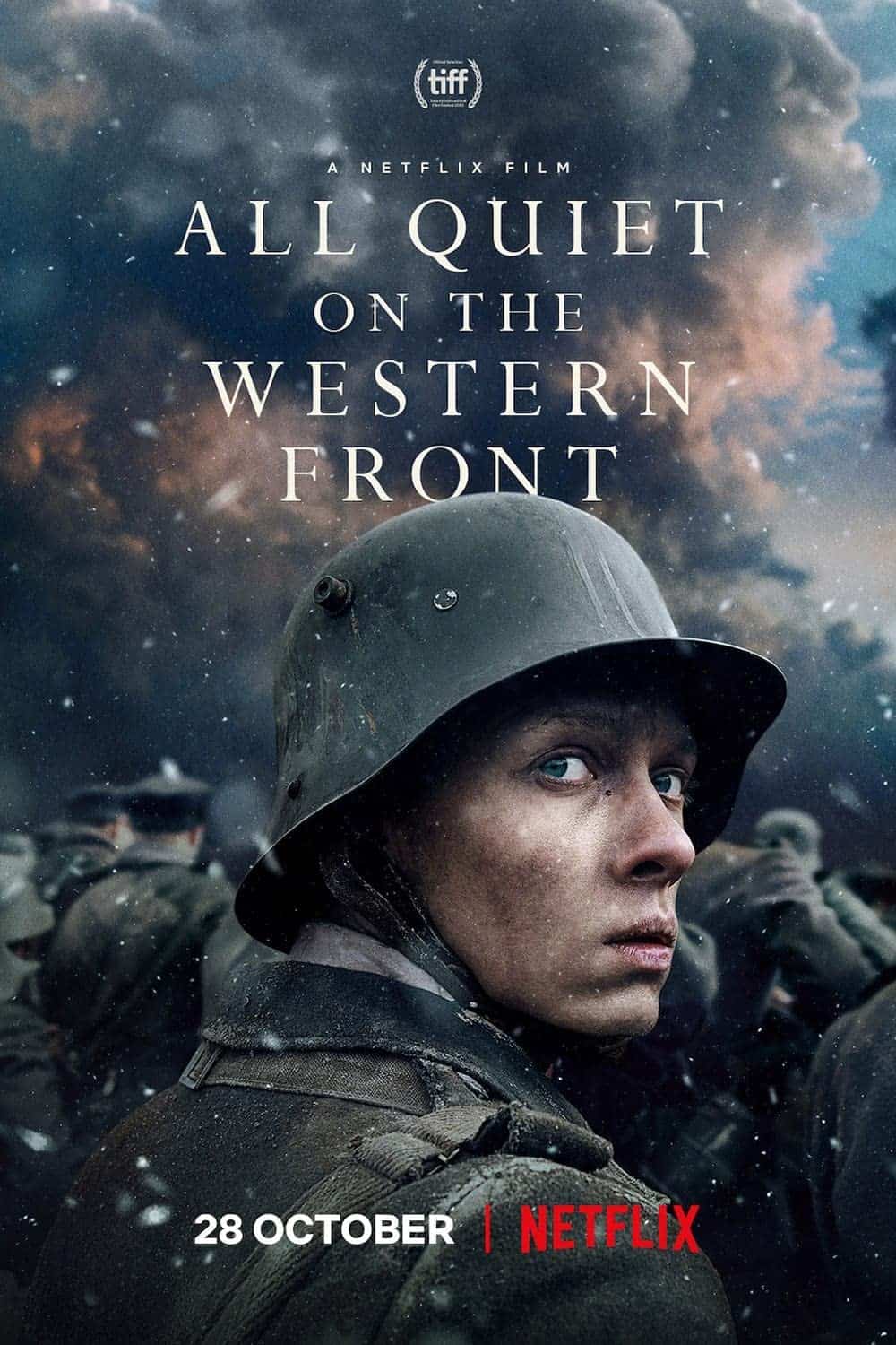
ALL QUIET ON THE WESTERN FRONT
JACK
You’d think a soldier would be more afraid of what he walking towards than walking from, wouldn’t you? But this poster does a good job of setting up the premise of one of the best true anti-war films I’ve seen in a very long time. It asks questions. It doesn’t answer them. Usually a good thing.
8/10
DYLAN
The image tells a story. The characters in the background are all facing forward towards what looks like a blaze of smoke. What’s interesting is that the character in the foreground seems to be looking in the opposite direction. He looks in fear. Is it the last glance of home and safety he sees, or something more sinister. I also like the fact it contrasts the usual American soldiers we are used to seeing. A flip of perspective. It’s not overwhelmed by text and looks real. It makes me think a lot of thought had been put into this film and therefore it is probably going to be good. I want to know what he is looking at. I want to know what has caused the blaze. I want to see what comes next.
8/10
AVATAR: THE WAY OF WATER
![]()
JACK
Meh. Admittedly the only one on the list that falls into the trap of let’s stick a bunch of floating heads somewhere over a remote world landscape. I’m not left with any questions to answer. I’m not given any clues. I’m not given any fun, any winks, anything really. Maybe I’m too cynical and, off the back of the success of the first film, it just needs to announce its arrival with some familiar blue faces, but I am left feeling pretty flat.
2/10
DYLAN
A cliché in movie posters is that of a series of headshots compiled together and gently faded around the edges. If they want to show the main characters are now a family, they could have done this in numerous other ways without having to show all of them, or even show them at all. Showing an element of the water people creates curiosity to a new part of Pandora being explored which creates interest to those who loved the first Avatar and seeing more of the magical world in which it exists. However, they could have pushed it further. The movie title “The Way of Water “already says quite a lot. I think what it lacks is a bit of magic.
2/10
THE BANSHEES OF INISHERIN

JACK
This is the only one on the list where I’ve been intrigued by a line of copy. These lines are oh-so-often cliches and parodies of themselves or meaningless platitudes about life. But there’s something intriguing about “Everything was fine yesterday”. And I like the design, too. One looking to the distance. One looking at the other. There are nods to a story. Nods to a conflict. Nods to, what I hear, is a bloody good film. Well, it has been nominated for Best Picture, hasn’t it?
6/10
DYLAN
This image tells a story. Two men standing at an awkward distance apart. One has a dog which separates the two. The one on the left staring out to sea. The one on the right looking at the man on the left. The dog too also is looking in a similar direction. There’s rain out back. It doesn’t feel like the normal day someone would go to the beach and relax. Does the man on the left sense something in the weather. Does the man on the right see him as deranged? The line “Everything Was Fine Yesterday” could play into the rain in background or something deeper. The rain also sits in-between the two men. Maybe a symbol to a storm between them. Or a foggy haze. Maybe even sadness. If I were to look at this as a photograph, I would consider it nice, but it wouldn’t make me go wow. But it does tell a story and one I’d like to know more about.
8/10
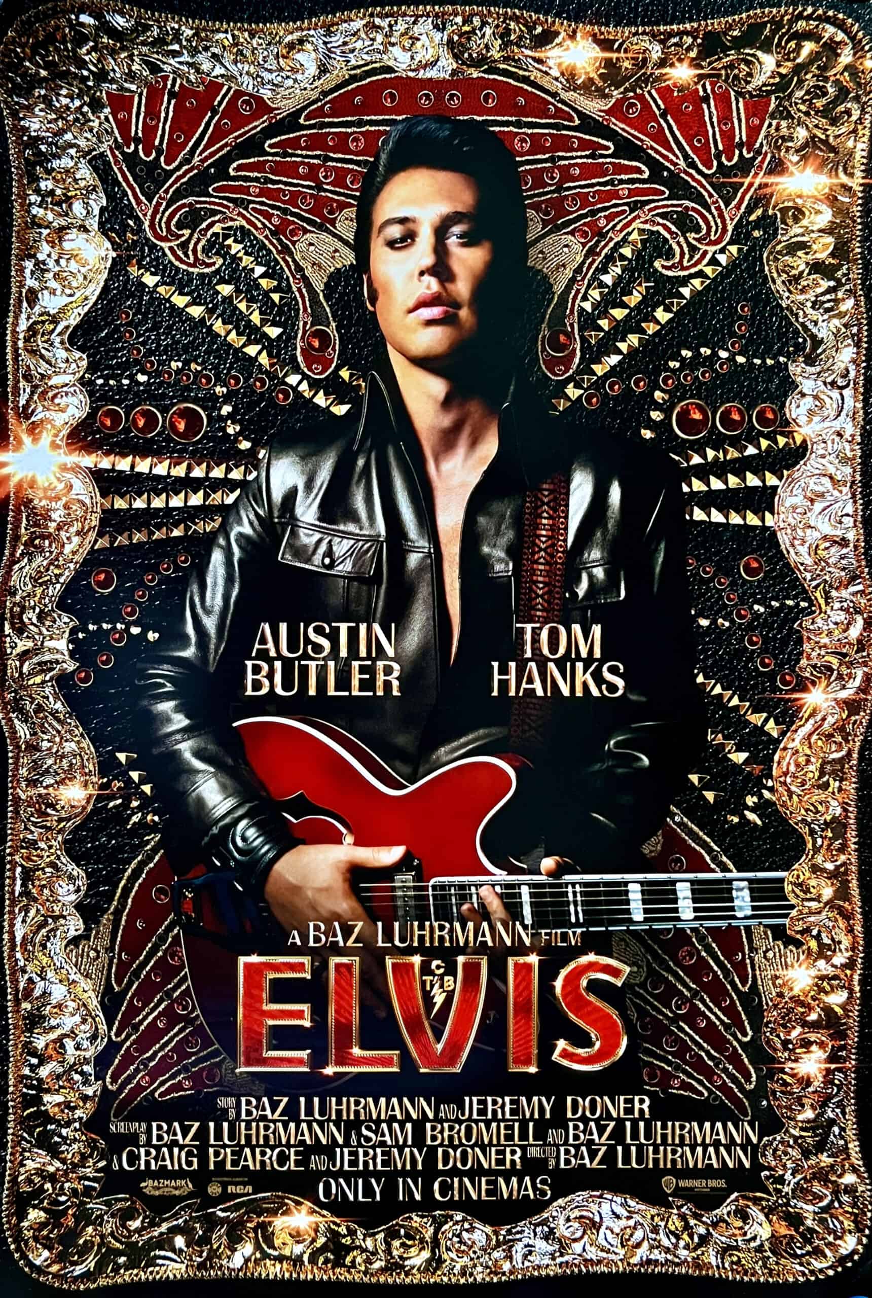
ELVIS
JACK
This is meant to be the story behind the rhinestones but that’s all we’ve got given to look at. Don’t get me wrong, they’re really nice rhinestones. But it’d be nice to have some nods to something we don’t know – isn’t that the whole point of the film?
4/10
DYLAN
It’s eye catching. It feels opulent and glamorous. It looks like a crown has been unfolded to create the border. Elements of his style make the backdrop. But most great musicians have a great story to tell, and I feel like this is what it lacks. A personal insight into him, not just a glamorised piece of the fame that came later.
6 /10
EVERYTHING EVERYWHERE ALL AT ONCE

JACK
This poster looks like its title. It’s chaos, but in a beautifully put together hypnotic circle bringing you right in. It’s a fab illustration style, too and gives me a magical vibe to the whole film, which, if I’m not wrong (I still haven’t seen it yet), is bang on for the film.
9/10
DYLAN
It has a surrealist vibe to it. Interesting characters with interesting expressions. Looks slightly obscure and a film I’d watch. It does exactly what the title says and feels like a scattered mind full of thoughts. Peaceful ones, stressful ones, and absurd ones. It feels bespoke and has a thought behind it. Not just a still from a scene. An art piece in itself. Something you could imagine placing on a wall and being enjoyed for what it is and not for what it is selling.
9/10
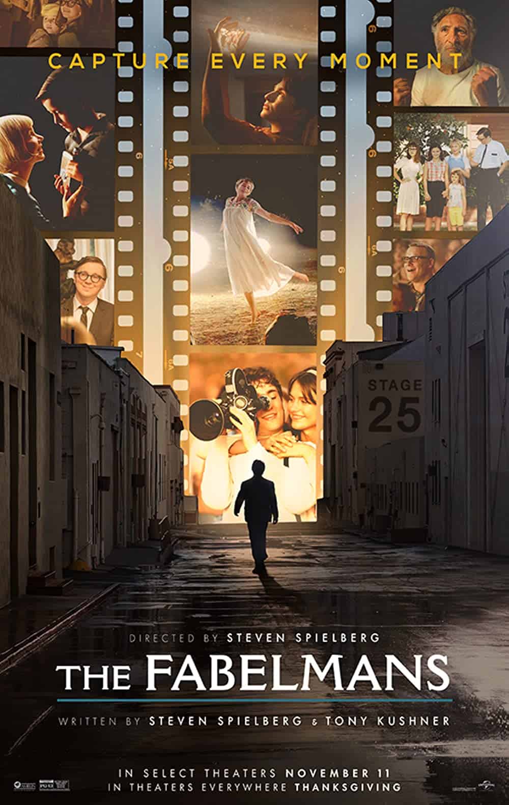
THE FABELMANS
JACK
Doesn’t it feel like a love letter to cinema? And from reading the synopsis, it does seem like it is Spielberg’s take on exactly that. A mystery figure striding into the lights of Hollywood. It does a good job of setting the scene, but I’m not sure how much it delivers in tone or in tension.
5/10
DYLAN
I’m not really a fan of this poster. I personally find it quite boring. It doesn’t really do anything that grabs my attention. The images in the negatives are positives and look a bit boring as images. The line “Capture Every Moment” has so much more potential than showing film strips with a person walking into the distance placed over the top. I think this could have been pushed and made much more engaging.
4/10
TÁR
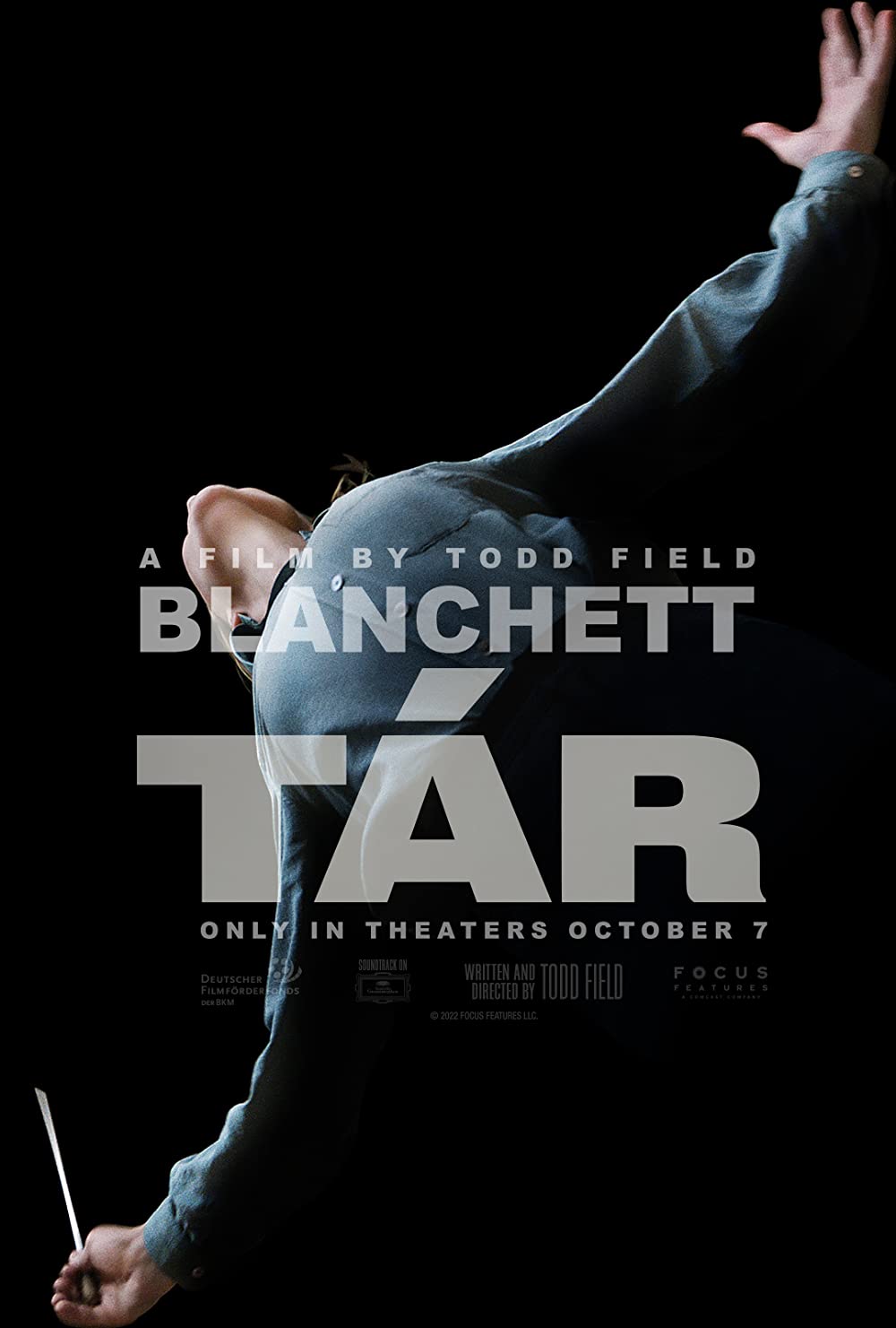
JACK
Is it a bird? Is it a plane? No, it’s Cate Blanchett. It feels pretty epic this. It’s harsh and stark. But it’s elegant. I don’t imagine there’s much given away in this other than a feeling they’re trying to convey. It makes me really want to go and watch it actually.
8/10
DYLAN
A beautiful shot. I like the pose. The person looks like the letter T and is full of passion. The tiny detail of the hand gives us a glimpse into what this film is probably about. A composer. Light is shining on them. It’s dramatic. I can almost hear it. From the elegance in the way the poster has been composed, it feels like the film as a whole will be aesthetically pleasing to watch. It feels closer to art than that of a blockbuster poster.
8/10
TOP GUN: MAVERICK

JACK
It’s not arty. It’s not fun. It’s not interesting. It’s not different. It’s doesn’t even vaguely try to bring Top Gun into the 21st Century. But who cares? It’s Top Gun. It doesn’t need to be any of that. It just needs to be as Top Gun as possible. It’s a fighter jet. It’s Tom. We all knew what the story was going to be. Permission to flyby granted.
7/10
DYLAN
A maverick is someone who thinks or acts in a way that’s different and unexpected. Seeing as this is the title of this film, it feels like they did the complete opposite for the poster design. It’s not new or unexpected. It feels like they got a shot of the two most expensive things from the movie and made it a poster.
1/10
TRIANGLE OF SADNESS

JACK
I don’t hate it. But I don’t love it. I’ve heard this film is fantastic. But from the poster alone I think I might dismiss it as a sort of straight-to-Netflix type of comedy disaster movie, most likely starring someone like Kevin Hart. Plus, the three characters in the back right really feel like a last-minute Photoshop job.
4/10
DYLAN
A captivating image. It has symmetry, interesting looking characters, and the captain looks awkward. The symmetry is broken by the fire on the boat. Again, contrasting the relaxation of the man on the sunbed to the dangerous chaotic reality unfolding in the background. The typography looks like it plays into boats too. The letter “A” looks like that of a sail. It looks fun and visually arresting. I want to know what is going on.
9/10
WOMEN TALKING
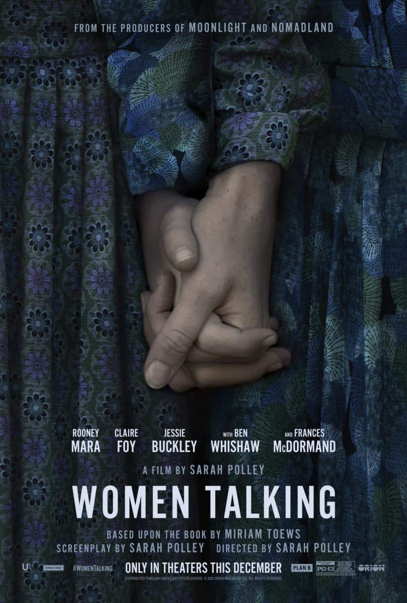
JACK
Makes me think of a cult, this. But there’s a nice level of storytelling in the image. I don’t know what the story is, mind. It feels like they’ve tried to come up with an idea for the poster separate to the film. As in, it’s not just a scene or a bunch of faces. It’s a summary of it in a picture, which is nice. There are not many others on the list that do that.
6/10
DYLAN
As a poster it doesn’t reveal much about the film, which I like. The lighting is stark and feels like they are holding each other for hope. The colours are nice and I like the symmetry. However, removing the title and looking at it just as an image I don’t find it super exciting.
5/10