Dune:
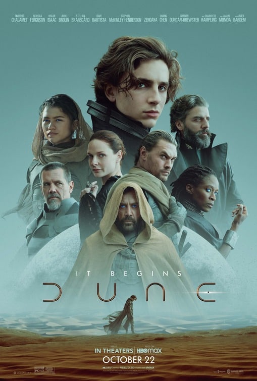
Stephen O’Neill: So it looks like the producers have demanded a Photoshop salad of predictable moody headshots rising from the same old dusty planet, with an Obi-Wan-alike thrown in for good measure. It’s clear the poor designer didn’t have a say in this. And who’s DUNC anyway? 3/10
Duncan Naylor: Definitely reminiscent of Star Wars. When I see work like this I have to wonder how much scope they had with the brief. A predictable montage that we’re all too familiar with that’s all about pushing the big names. The poster for David Lynch’s 1984 original is a million times better. A missed opportunity. 5/10
King Richard:
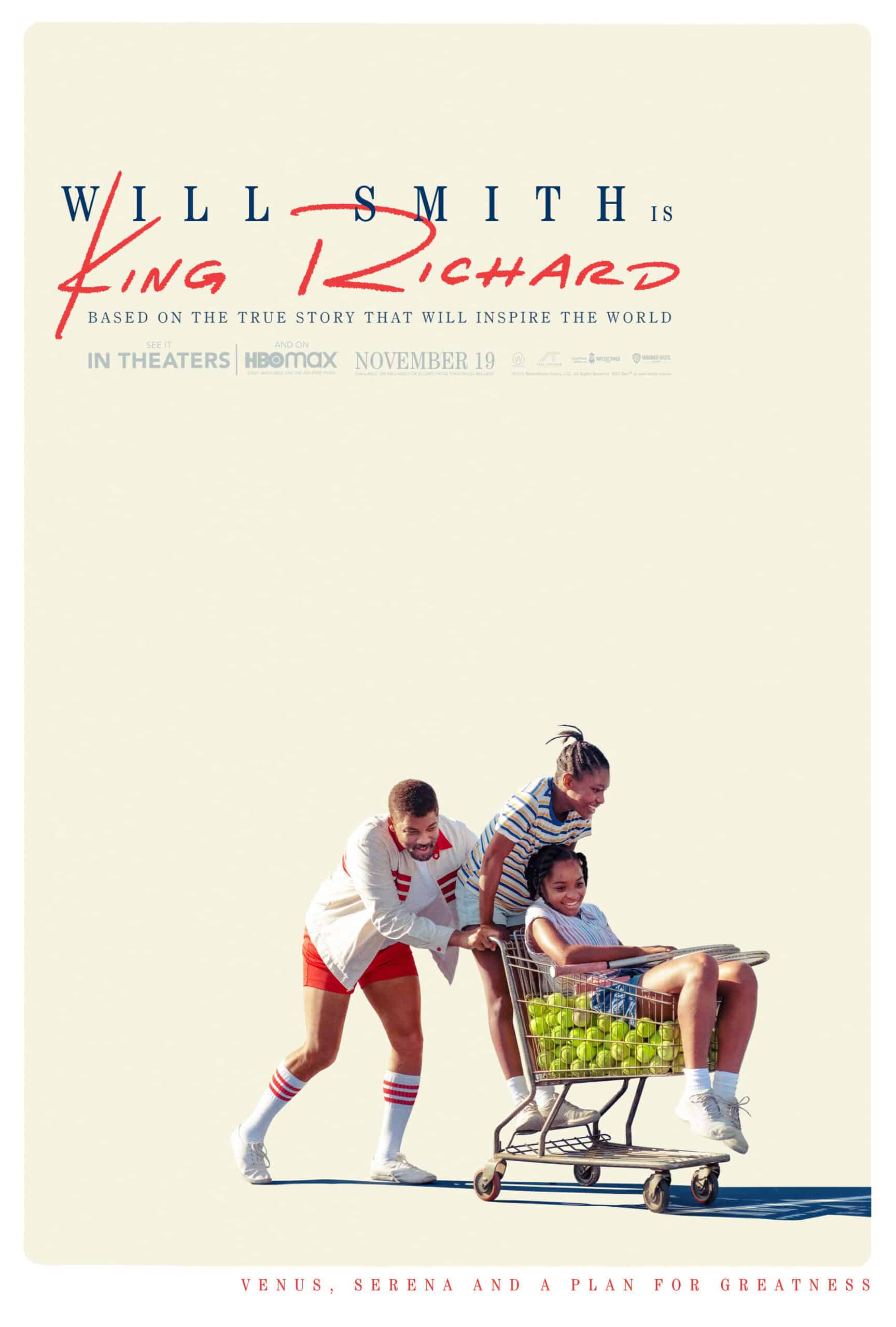
O’Neill: This reminds me of the fantastic Little Miss Sunshine poster, but with maybe less sunshine and the emphasis firmly on ‘miss’ due to that typographic mish-mash. It’s a strong image. 5/10
Naylor: Nice try but doesn’t quite get there for me. Kind of deliberately loose, but not. Frustratingly close to being good. 6/10
CODA:
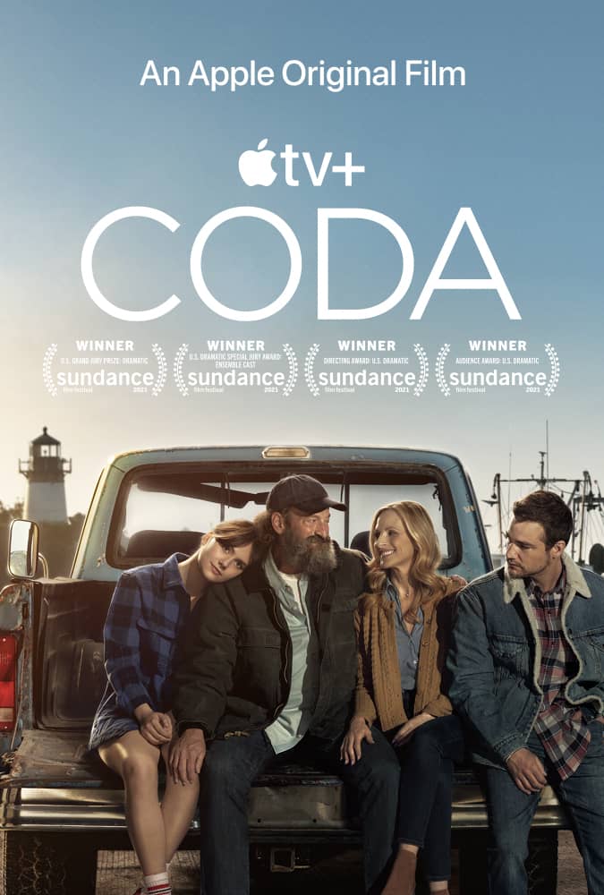
O’Neill: Looks like an ad for life insurance. Pensions perhaps? I think Apple might be involved… Perhaps this is this their new streaming service – Apple CODA? 2/10
Naylor: King Apple? Agree with Stephen – definitely looks like an Apple TV ad – or a PowerPoint presentation. No idea what’s going on and cast relegated to second billing. 4/10
West Side Story:
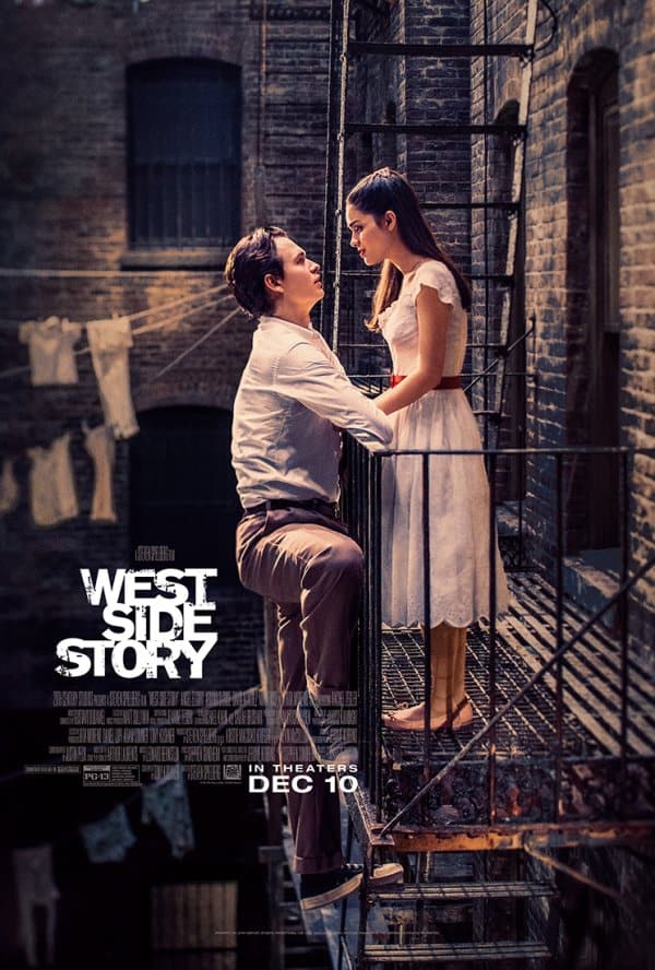
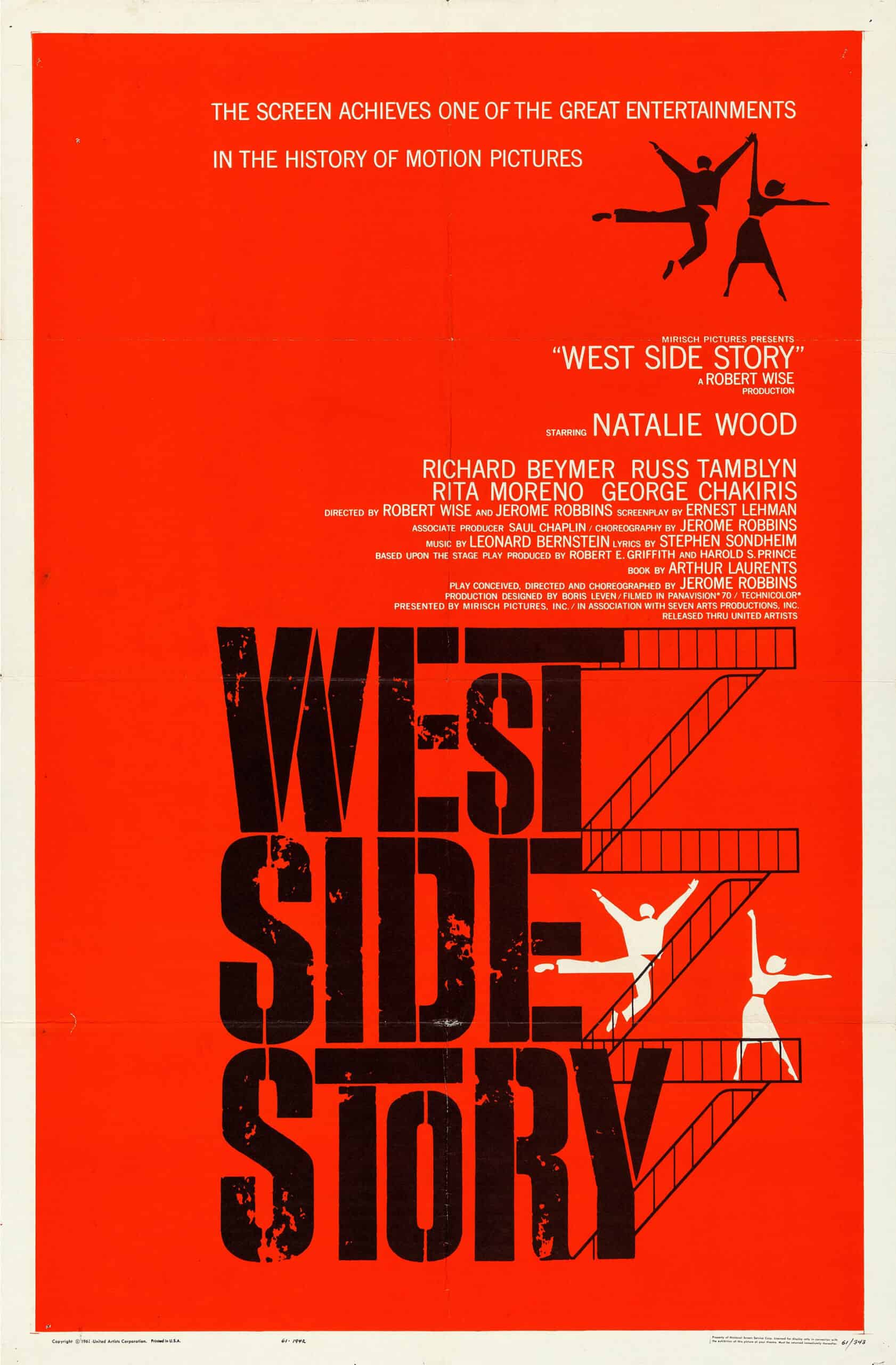
O’Neill: When you say West Side Story, you immediately think of a vivid attack on the senses, underpinned by Leonard Bernstein’s banging score. AND a dynamic poster by Saul Bass. So how did this happen? Looks a bit like an am-dram Romeo and Juliet. 2/10
Naylor: I don’t feel as strongly as Stephen but he’s on the money with the clichéd R&J look. It’s OK but where’s the energy and life? Seen it all before. 4/10
Licorice Pizza:
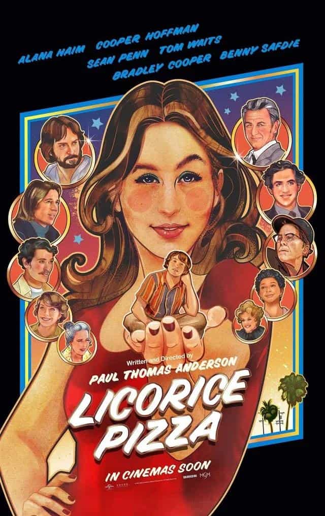
O’Neill: Finally! Charming illustration style – lots of heads which I’m starting to understand seems an unavoidable thing, but tackled in a way that actually works with the poster as a whole. 9/10
Naylor: We’re definitely on the same page with this one. It feels fun and authentic and they’ve nailed the 70s aesthetic. Of all the nominees – this is the one you’re going to remember. 9/10
Belfast:
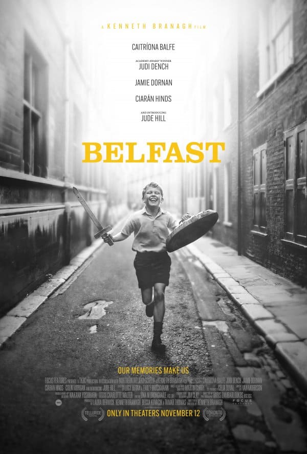
O’Neill: Love that image! The bottom half of this poster is wonderful. But that list of names at the top doesn’t really add anything does it? It does seem to be jumping on the Roma bandwagon a bit too. Bottom half 9/10 – Top half 1/10
Naylor: This works. They’ve stayed true to the film with a cracking black and white image that tells a story. Shame about the roll call. 7/10
Nightmare Alley:
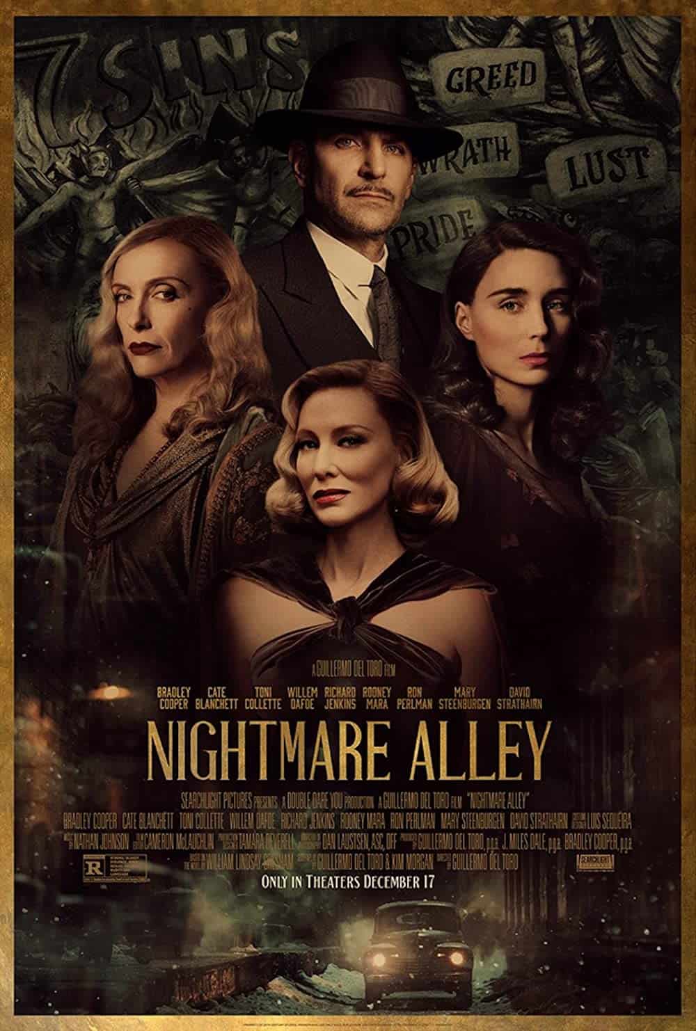

O’Neill: And another montage… I’m guessing the studio dictates exactly what has to be shoehorned into posters nowadays – big heads, tiny cars, words that sort of explain the film? Decades of design history, 20-odd updates to Adobe products and the hand-drawn 1947 version with a giant Tyrone Power beats this hands down. 4/10
Naylor: I like the 40’s feel. Shame they didn’t use just the one image rather than cramming in four people and a car – but definitely a front runner for me. 7/10
The Power of the Dog:
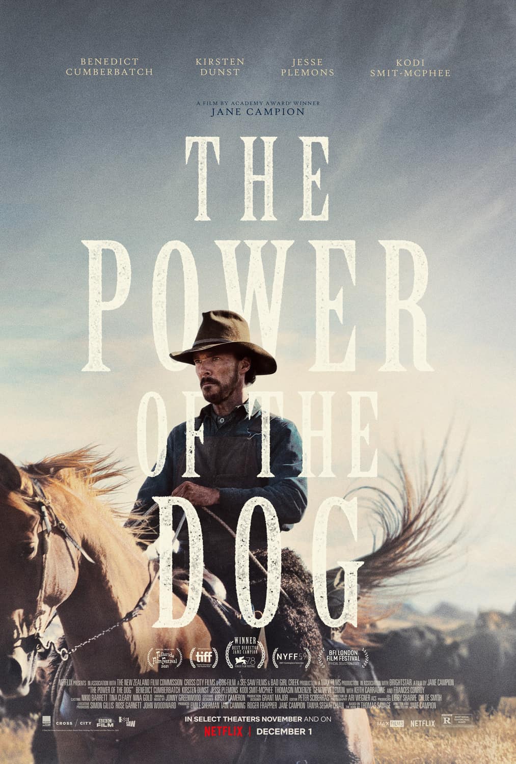
O’Neill: The choice and treatment of typography suggests a Western, but why not go the whole hog and use actual letterpress – adding imperfections, warmth, personality. All those things are missing and it seems a bit cold. Not sure the image adds much – actually, why any image at all? The title alone, with gorgeous letterpress would be much more intriguing. 4/10
Naylor: It’s ok – it just doesn’t excite me. And what’s with the horse cropped bottom left? Clearly a design decision but reads as a mistake. Yes yes yes to gorgeous letterpress. 6/10
Drive My Car:
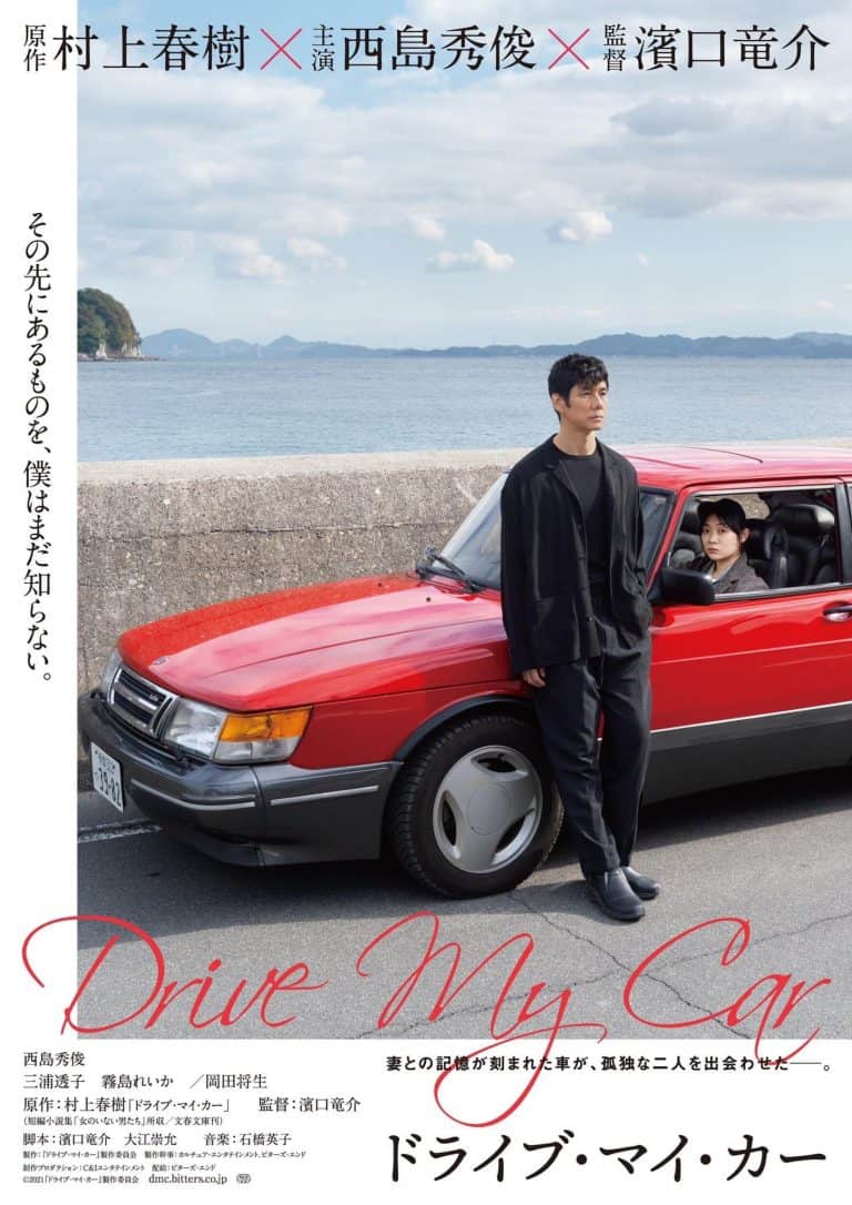
O’Neill: Like this! Interesting off-centre layout, intriguing image too – but that hand-written lettering is a bit jarring. 6/10
Naylor: This stands out. It’s different, I like it. Not sure about the scripty type though. Definitely has me intrigued and wanting to know more. 7/10
Don’t Look Up:
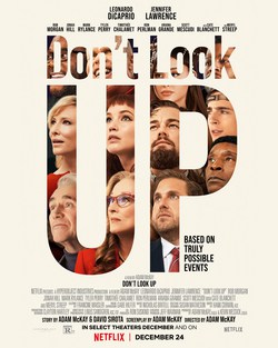
O’Neill: And finally – well it’s Return of the Giant Montage, but at least with an idea behind it. Just feels, like many of these posters, a bit lifeless. Timothée looks like a bit of a last-minute addition too. 4/10
Naylor: The designer obviously had direction to get as many of the star-studded cast into this poster as possible. Using the title as a holding device makes sense but it just looks like a bit of a mess to me. Generic and predictable. 4/10
And the Oscar for Best Picture poster goes to… Licorice Pizza! Bold, full of personality and unlike anything else on offer. Pretty much exactly what you’d expect (and hope for) from a Paul Thomas Anderson film.
Original article can be found featured here in Campaign Live and in Campaign Live US.
A massive congratulations for Stephen and Duncan for their engaging and entertaining work.