Aperitivo culture dates back to the nineteenth century in Italy, when bars began experimenting with mixing their house drinks, to produce their own particular combinations of bitterness, herbal flavours and sweetness. In the 1860s, a café owner from Milan named Gaspare Campari, started to promote and sell his own successful blend on one very important condition: bars had to display a metal Campari Bitters sign in the window.
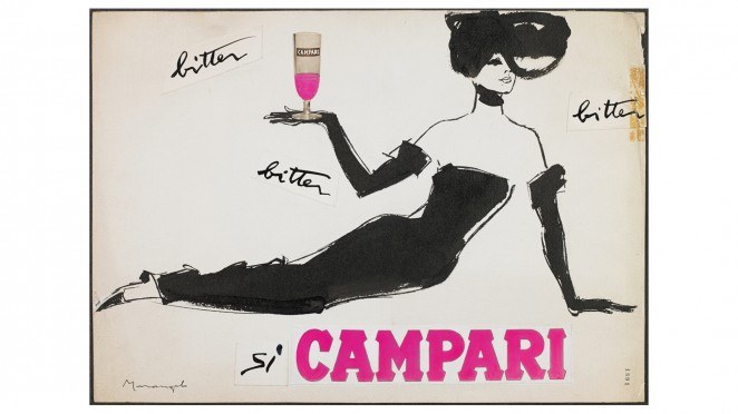
Since then, Campari has created some of Italy’s most distinctive and eye-catching publicity – and this exhibition will show a wide breadth of that imagery, loaned from Campari’s archives in Milan. Taking us from the Belle Epoque to the 1960s, there will be original lithographs, posters, ads and packaging designs that have made this one of the world’s most elegant and powerful brands.
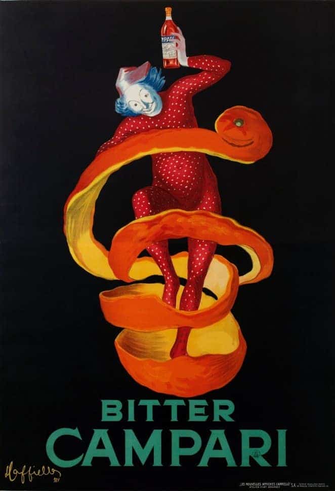
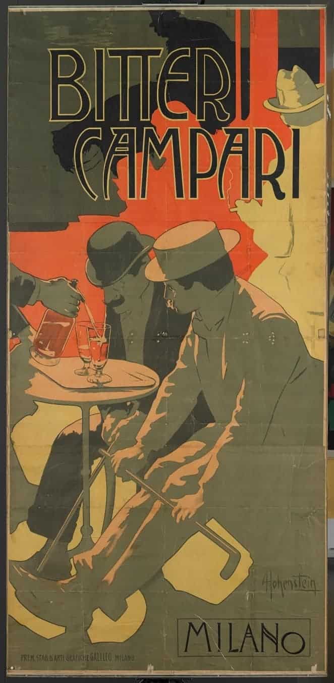
At the turn of the 20th century, Gaspare’s son Davide became the driving force for the publicity for the company, enlisting celebrated poster artists of the day, such as Leonetto Cappiello, Marcello Dudovich, Adolf Hohenstein, and Marcello Nizzoli. This helped to build the brand, with immediate, vivid, powerful designs. As curator Roberta Cremoncini says, “Milan changed very much in the beginning of the 20th century – there was electricity and trams, and advertising had to be very quickly recognisable. It had to have impact, so speeding buses could see the image.”
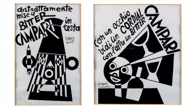
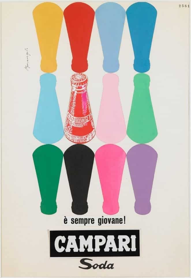
With the advent of futurism, Fortunato Depero’s bold, monochrome ads from the 1920s showed how the publicity always mirrored trends and movements in the art world – indeed, for many artists, poster design was a way to make a living. Similarly, post-war designs by artists such as Franz Marangolo and Bruno Munari reflect the influence of pop-art – using the style of mass-produced screen prints to publicise mass-produced products.
As well as this striking publicity, the exhibition brings together all manner of Campari ephemera – a giant bottle top that doubles as a clock, ancient wooden crates, and even some of those early enamel signs that were the starting points for one of the most iconic and celebrated Italian brands.
Chin chin!
As featured on typechap